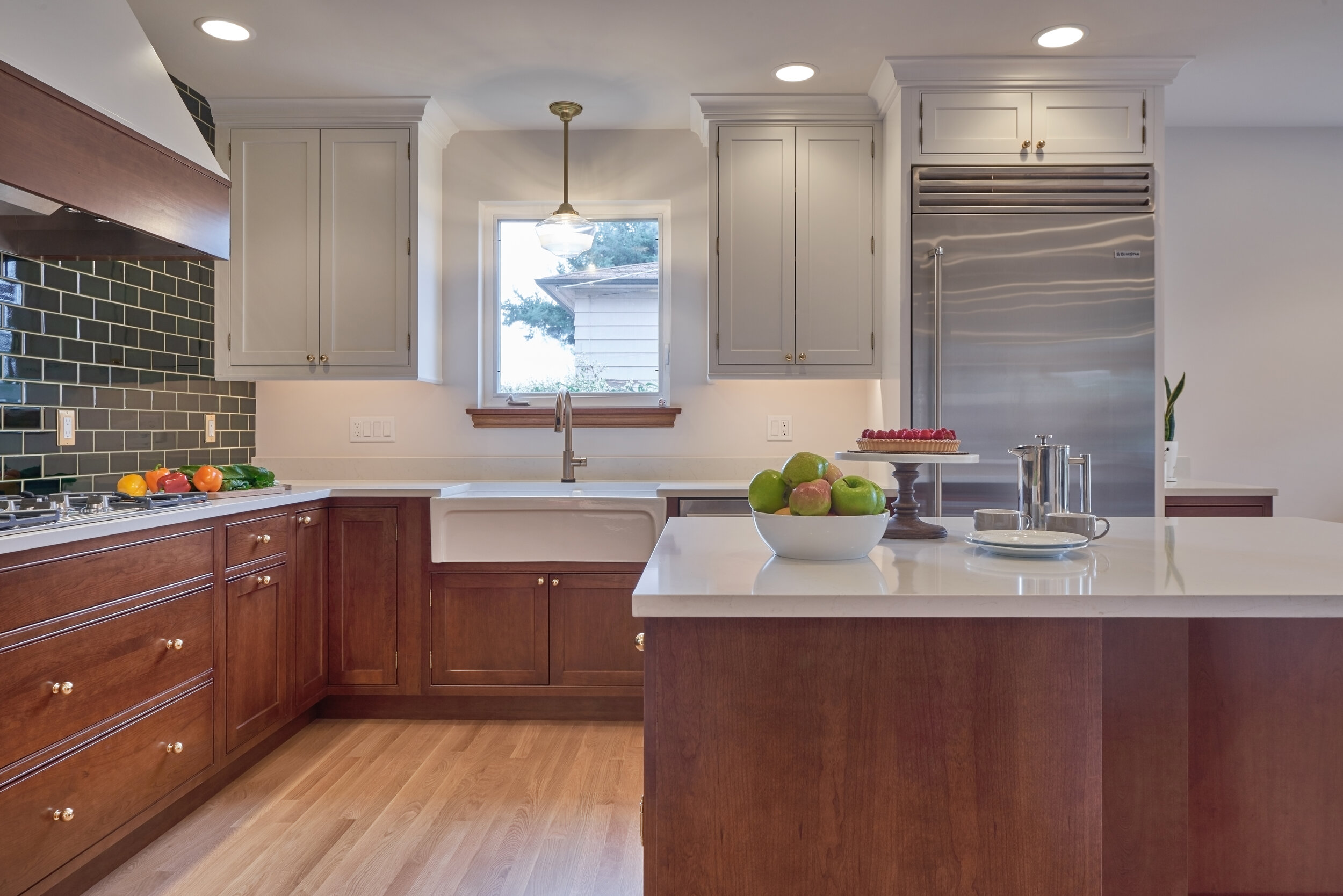
The 1980s cramped u-shaped kitchen did not meet the needs of this growing family. The client cooks fresh food daily and is an avid baker. Open site lines, additional prep space, additional storage, space for the young children’s activities, and keeping within the home’s 1920s aesthetic, were all central to this kitchen’s programming and scope.

As with all remodeling projects there are many challenges requiring solutions, but the following are stand outs:

BEFORE

The first challenge was that we knew the future held a significant second floor remodel, so all design had to accommodate for that. The central wall needed to remain in the existing location for structural & HVAC purposes. The design captured the existing dining room built-ins, mini pantry, and small closet to create a single large pantry with roll out trays and dog toy cubby with cabinet above. The entire south wall had to be furred out to capture the existing plumbing bump-out and to replace old galvanized pipes with new ABS. Furring the wall out also simplified the geometry in the kitchen and was warmly welcomed by the clients.
The second challenge was to add more prep space and accommodate today’s modern family open-plan lifestyle. The wall between the kitchen and the dining room was removed to increase site lines and the kitchen’s square footage. Even though much of the full tiled wall is void of upper cabinets to create that gorgeous green tile “TA-DA,” the perimeter cabinets, pantry, and island significantly increased the kitchen’s overall storage. The island allows children to eat, read, play, and do homework on the perimeter of the kitchen while cooking and baking are underway. Generous clearances between the island and the perimeter cabinets allow for comfortable circulation. Space was created for all family members: a kids’ toy/book cabinet, a dog-toy cubby, a custom height “command central” station which also functions as the baking work surface to roll and knead dough.
And, finally, while we were tasked with modernizing the house, we also wanted to respect the home’s 1920s heritage, yet with fresh and modern finishes. Subway tile is a classic form, but the rich deep green adds a modern twist. Taking the tile from the countertop to the ceiling in a traditional brick set pattern added visual texture & interest. The inset cabinetry’s subtle imperfections create a sense of history, while the two-tone cabinets offer a contemporary feel. Brass finishes and fixtures beautifully fit the home’s heritage.


Two years later we were invited back to remodel just the existing second floor bath, as the clients decided after living in the space the extensive remodel was no longer necessary. This time we had the added challenge to both respect the home’s heritage and ensure the bath felt of the same era of the new kitchen.
There were three major design challenges in the bath:
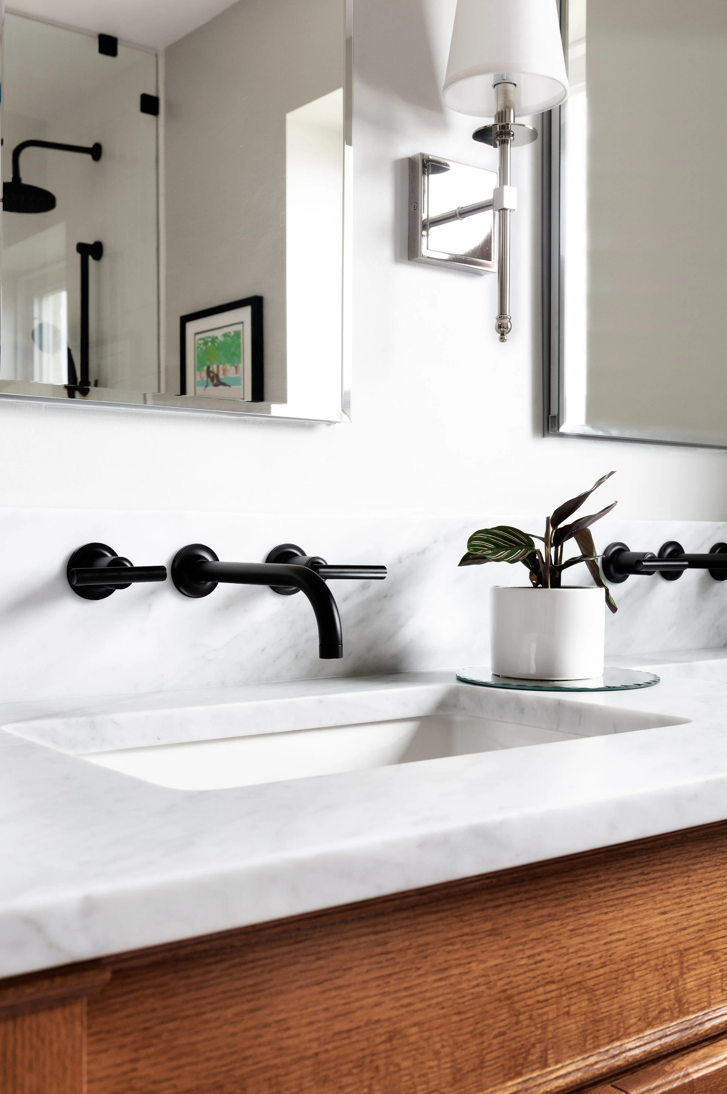
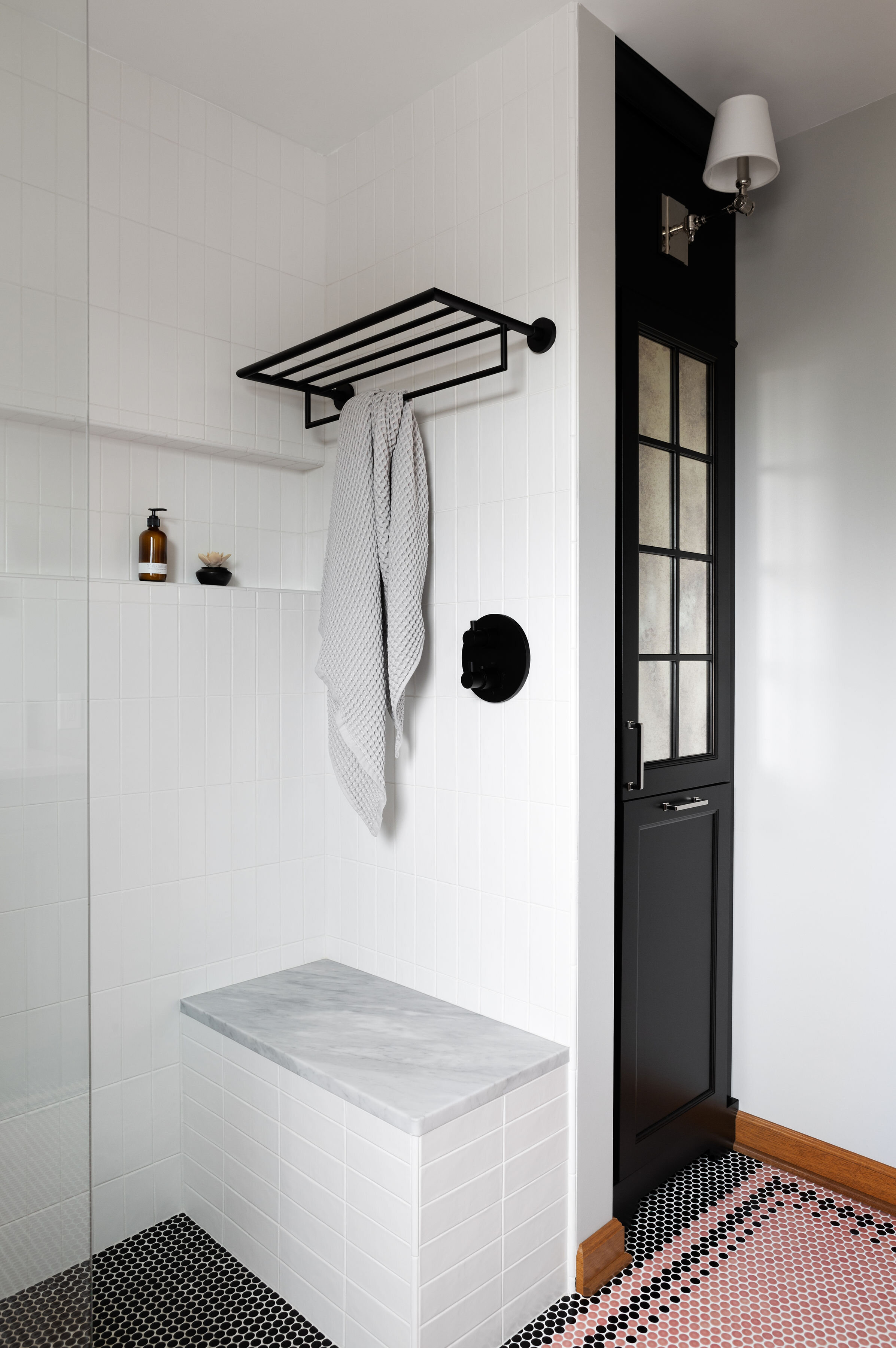
Opening up the dark and crowded space—as we did to the kitchen. This was achieved by capturing space from an oversized closet in the adjacent bedroom, which created room for a generous walk-in zero-threshold shower with bench. The shower glass also helps to visually expand the space, whereas before they had a shower curtain contracting the space.
The toilet location. The bath is directly above the gorgeous recently remodeled kitchen. Because of the bath’s location, there was a distinct possibility that the kitchen ceiling above all those stunning kitchen finishes would have to be opened up to move the toilet. In order to avoid that, the toilet was rotated and moved within the same joist bay; in this way all the plumbing work was done from the bath floor. We saved their fabulous kitchen and their budget—always a good thing!
Bringing the clients’ two different visions together. He wanted a black and white bath with a touch of warmth. She liked that idea but wanted to add an apothecary gothic feel and a pop of pink in a nod to the original 1920s tile. Happily, when presented with the tile options during the design process, he embraced the pink penny round floor tile, because it felt more like a neutral on the floor to him. The addition of the black penny round tile detail nods to his wish for a traditional black and white bath feel. The design also skillfully adds a warm wood vanity with traditional detailing and a black apothecary-like linen cabinet. To add a touch of “traditional,” an antique mirror was installed. And how can we forget the marble? Although he is not a fan, this was a must-have for her. Our client found the remnant piece, and it looks as though it has been there since the 1920s. The clients are thrilled with the end result—as are we!